Kusari
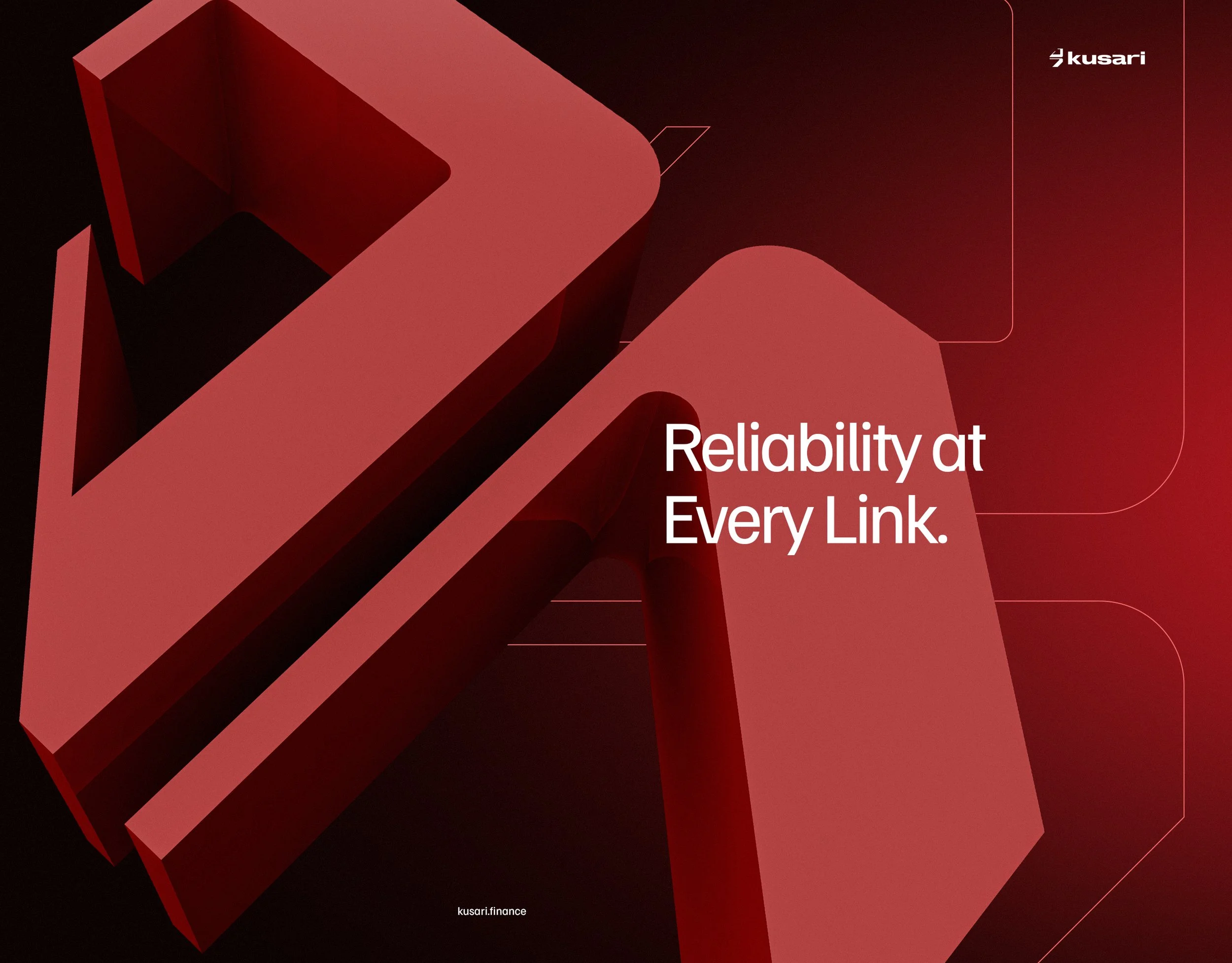
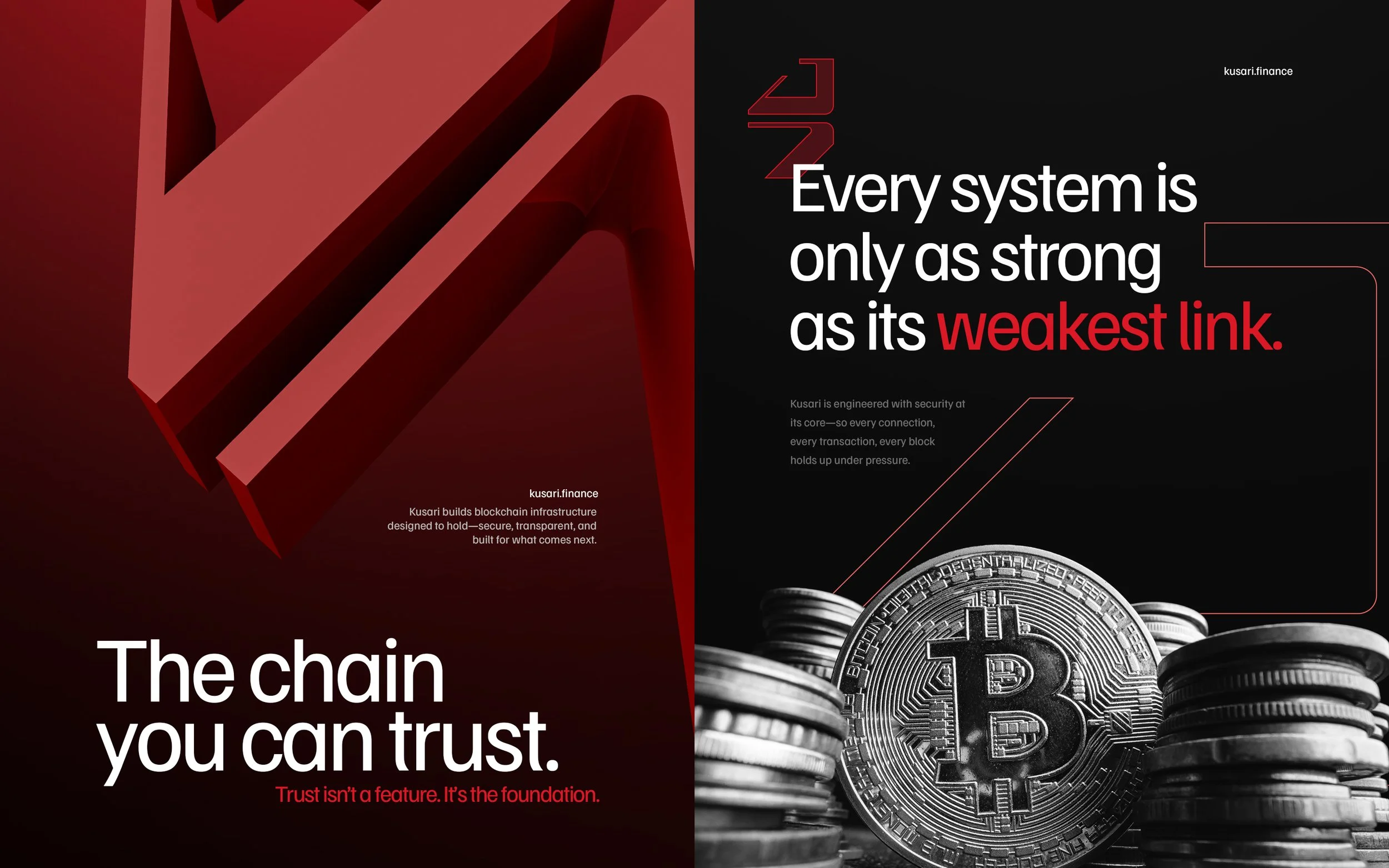
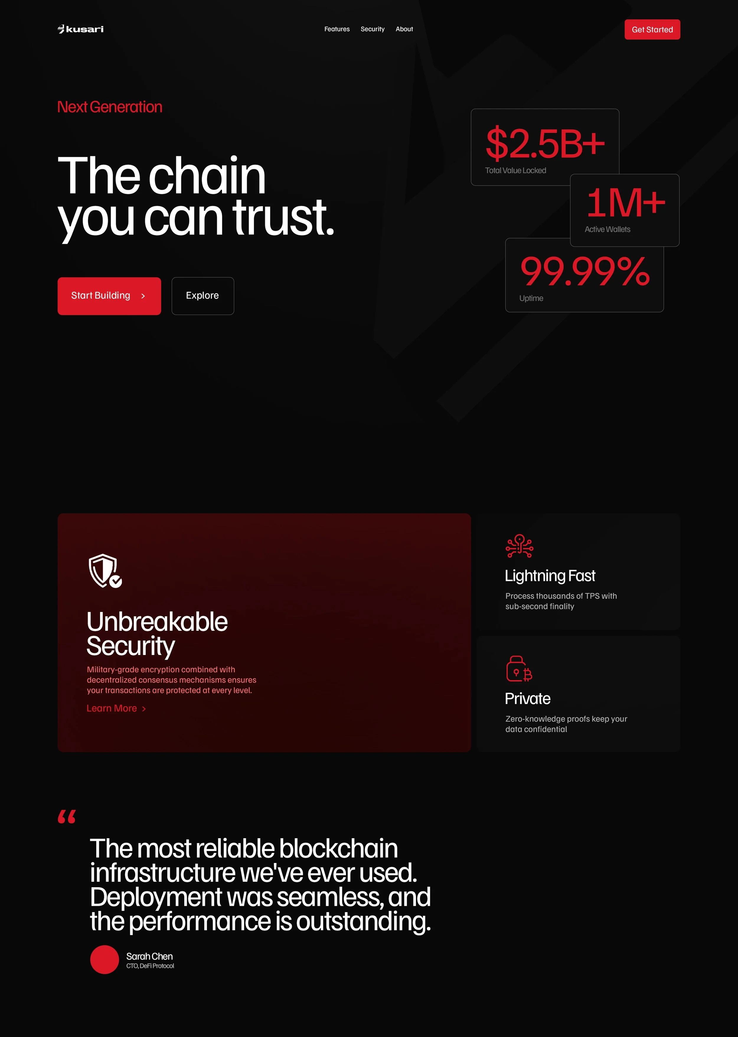
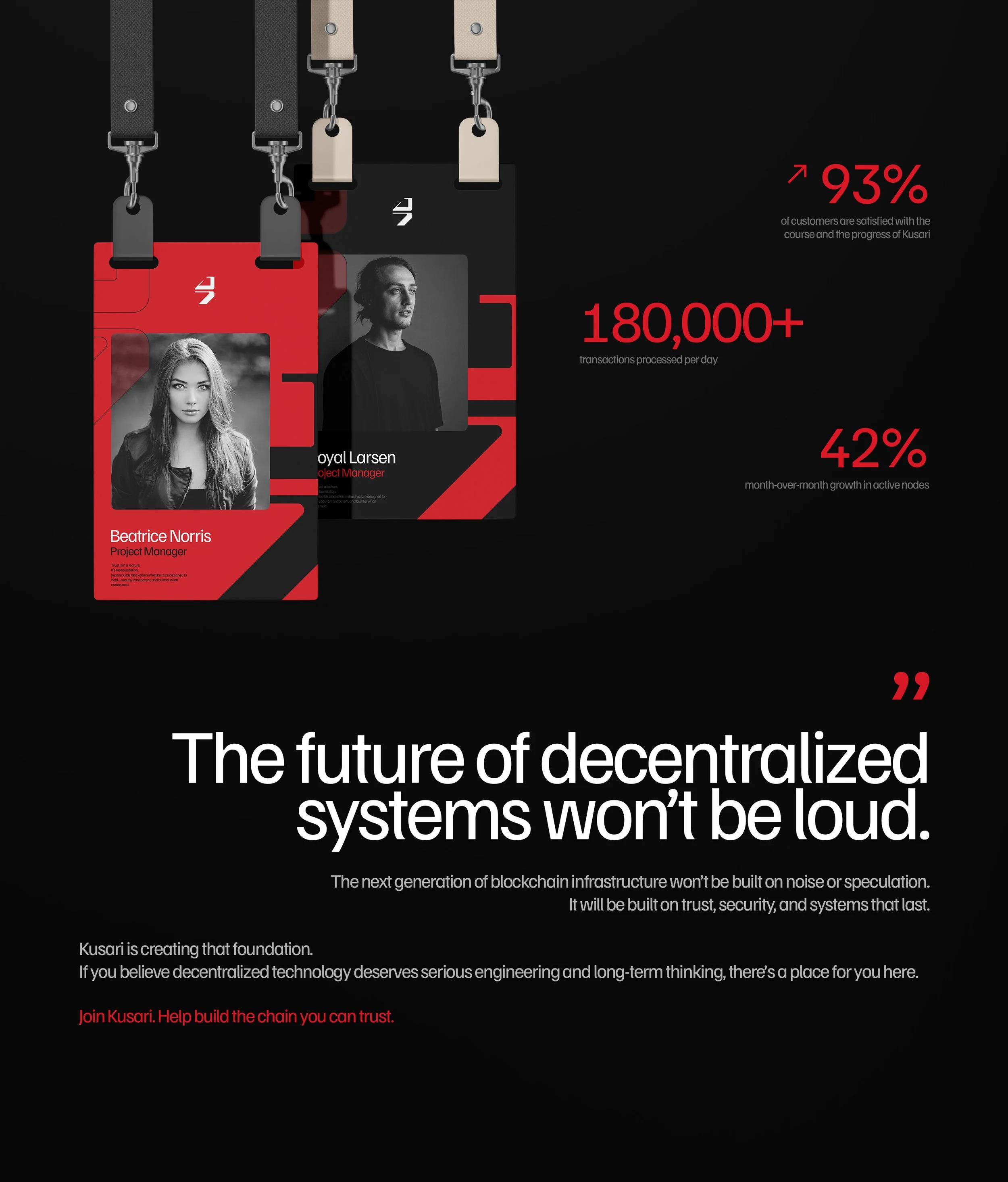
Kusari is a blockchain-focused technology company building secure, scalable, and trust-driven digital infrastructure. This branding project aims to define a strong visual and verbal identity that positions Kusari as a reliable, forward-thinking force in the blockchain ecosystem—balancing technical credibility with human clarity.
-
Kusari (鎖 / 鎖り – Japanese for “chain”) symbolizes connection, strength, and continuity.
The name reflects blockchain’s core principles: linked systems, transparency, and unbreakable trust. The brand should visually and conceptually reference these ideas in a subtle, refined way rather than literal chain imagery. -
Calm and confident
Intelligent, not arrogant
Minimal, but not cold
Technical, yet accessible
Forward-looking and disciplined
-
Design Principles:
Minimalist, structured layouts
Strong use of grids and systems
High contrast with intentional negative space
Color Palette:
Dark, neutral foundations (charcoal, deep blue, black)
Subtle accent colors (cool green, electric blue, or muted silver)
Avoid overly saturated “crypto neon” tones
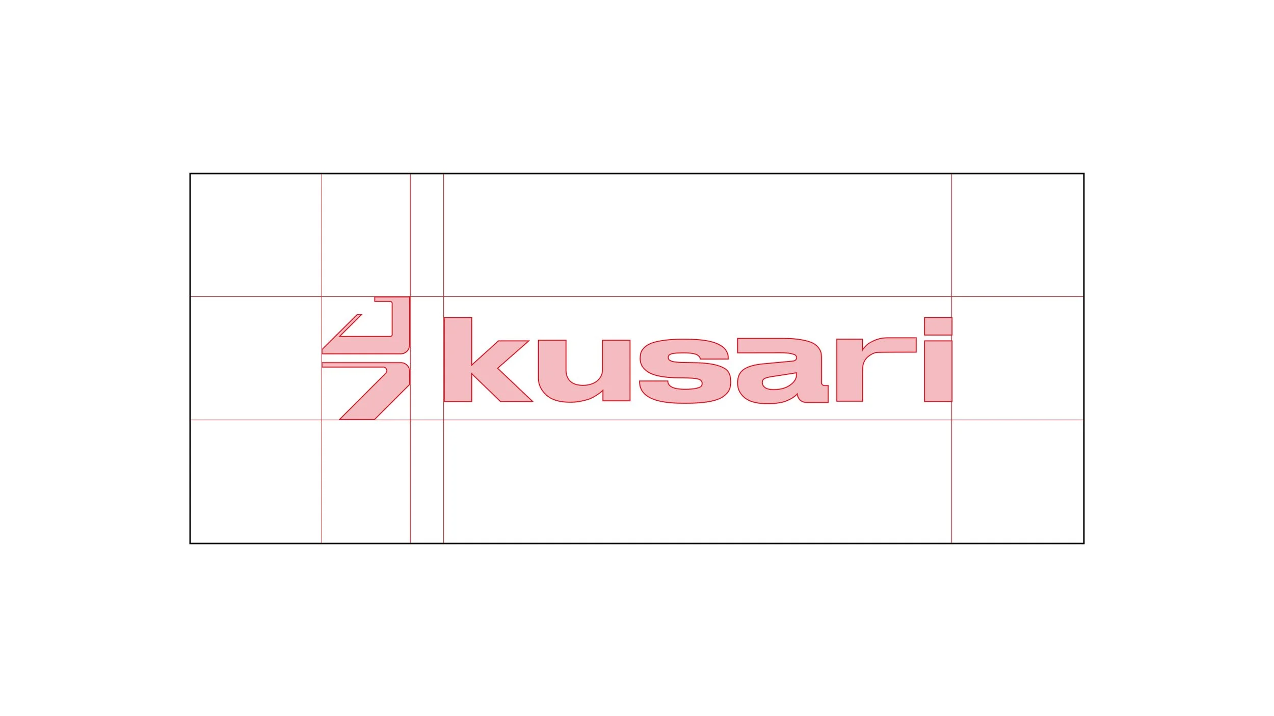
Typography:
Clean, modern sans-serif
Technical but readable
Balanced hierarchy and spacing